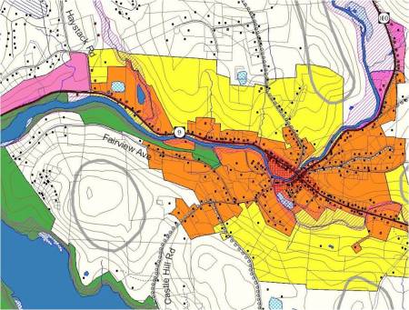
Jeff Nugent, Windham Regional Commission (reprint from a 2003 VGIS News)
At first, the map request from the Wilmington Planning Commission seemed challenging enough: create a map that would clearly show all six different land use districts, two additional overlay districts, source protection areas, deer wintering areas, wetlands, floodplains, scenic roads, contours, and so on.
Designing a single map that displays all these features with distinctly different symbols and colors is not a simple task. Then the planning commission added one more requirement: make the map so that one of their members, who is color blind, could read it. Designing this map now seemed all but impossible.
About five percent of people have some sort of color vision deficiency, and ten percent of all males are at least partially color blind. Most color blindness results in a person’s inability to distinguish between some shades and red and green. If you’re a GIS person, chances are at some point you have made a map that someone had trouble reading.
The Color Brewer web site (www.colorbrewer.org) offers color schemes that are distinguishable by a person who is color blind. According to the web site, “ColorBrewer is an online tool designed to help people select good color schemes for maps and other graphics.”
At ColorBrewer, you can test all sorts of color schemes using hypothetical data and see how they would look on a map. The site developers have created schemes that are “friendly” to color blind people, photocopiers, LCD projectors, and more.
Color schemes with up to nine legend classes (i.e. nine different colors) can be tested. The fewer the number of legend classes, the more color blind friendly schemes are available. Hue, saturation, and value figures for each color in the scheme are provided, and these numbers can be used in ArcView 3.x’s legend editor to reproduce the colors (click on the ‘custom’ button in the color palette window where these values can be entered).
The Vischeck website (www.Vischeck.com) provides some background information about color blindness. Perhaps more importantly, however, the site offers a utility where you can load an image file (such as one of a map you’ve produced) and Vischeck simulates what your image would look like to a color blind person.
Armed with these two tools, I set out to produce a map that would prove to useful in conveying information to all members of the planning commission. I first developed a legend for my map using a color scheme from ColorBrewer. I then created a JPEG image file of the legend and ran it through Vischeck (small files sizes work best in Vischeck; hence the JPEG of the map legend and not of the entire map itself).
Oddly, the results from Vischeck showed several of the ColorBrewer colors, particularly the red and green, would appear similar to a color blind person. Plus the map, to my non-color deficient eyes at least, wasn’t the most visually appealing piece of cartography; the colors were simply too stark.
To correct these shortcomings, I went through several iterations of tweaking the ColorBrewer scheme and running it through Vischeck. Omitting several of the confusing colors (retaining the softer colors that looked good together) and instead employing some cross-hatch patterns for a few of the features also helped. The goal was to make the colors more visually appealing to people without color blindness and at the same time more distinguishable to a person with color blindness.
For a final check, I ran a JPEG image file of a small portion of the actual map through Vischeck. In the end, I was able to produce a map that didn’t make me nauseous, had distinguishable colors and symbols according to Vischeck, and was “perfect” according to the planning commission member with color blindness.

Wow! Thanks a lot for that link. I had never heard of that site before and it looks awful handy. As someone who is absolutely horrible at picking color schemes, I’ll probably end up relying on this site a lot. You definitely got the “cool stuff” tag right on this one!
I was just tasked with developing a map color scheme for a client who is color blind; so glad I found this blog! I have used Color Brewer before, but had no idea about Vischeck; I’ll definitely have to check it out. Thanks a million!